
Writing Sample Essay
Fraktur After the Nazis
Fraktur blackletter is a script invented and used in Germany in the 15th century, which became a symbol of German identity and nationality. Born from Blackletter type, the script was used prominently until around the turn of the century, when new typography was exploding with different styles, and sans serif scripts became popular. When the Nazi party first began to gain traction in the 1930s, blackletter was a tool used by the regime as a symbol of Hitler’s promise to unite Germany and restore it to its former glory. Due to the negative influence of the Nazi party on the reputation of blackletter, its status as a German symbol has become highly derisive and has fundamentally changed how the script is used today.
Historically, Blackletter has strong ties to Germany's history since the first movable type set with Blackletter was produced in Germany. (1) The following time period was ripe with the fraktur/ antiqua debate, where German producers of type preferred fraktur blackletter because of its historic connection with the past as well as its bold and serious tone that was regarded as important to the German language and culture. Most of Europe, however, preferred using old Roman lettering called antiqua that was lighter, easier to read, and was rooted in historical Rome. This debate only solidified the nationalist value blackletter had on the German people and its nation’s history. Notable chancellor Otto Von Bismarck of Germany once wrote, “Writing in German with roman letters was as anachronistic as writing in French using ‘German’ letters”(2). In this quote, ‘German letters’ refers to blackletter and goes to show how seriously German history is tied to their scripts.
During World War two, after the Nazi party took control of Germany, they rushed to seize control of Germany’s nationalist script and used it everywhere from propaganda to the cover of Hitler's own book Mein Kampf. The Nazi party was not the first to use blackletter as a political tool, but its use was not just limited to campaigning. Even their official documents were set in fraktur, making it one of the most integral parts of their core identity, rivaled only by the swastika itself.
Despite all of this, the Nazi party switched platforms suddenly on January 3, 1941 (3), releasing an official statement proclaiming that fraktur is impure and has ties to Jewish influence in printers and designers. The truth might have been, however, that as they invaded further and further into Europe, where blackletter was rarely used, the fraktur typeface seemed more and more outdated. For the locals of the countries they invaded, fraktur was hard to read and hard for the printing presses to replicate outside of Germany(4 ). As a result, the Nazi party switched to more Roman typefaces, a complete reversal of their previous rhetoric.
After the war, fraktur fell out of use for quite some time. It remained, to the Germans who once saw it as a symbol of their nation, only a symbol of the atrocities of the Nazi party. In the 1970s several youth cults in Germany attempted to revitalize Nazism (5) using fraktur blackletter as a tool. It had gained a reputation by that point for being a symbol of extremism and far right ideology. As time passed, several Nazi and neo-nazi groups attempted to use the script for their own political ideology, but the type had morphed into a symbol of rebellion, of taboo. In the mid-90s rock albums like AC/DC and Motörhead used blackletter to emphasize the counterculture nature of their band. (6)
Because of what the Nazi party had done to promote the fraktur face alongside the atrocities of racism, antisemitism, and the many other violent acts they committed, they ineradicably branded it as a symbol of Nazi ideology and hate, regardless of the design intention. It remains today a symbol of evil, even in its use by edgy metal-heads; it references the powerful evil that once took over the script. The historical connection to Germany's history of the first printing press has been dissolved forever by evil men, and could never be the same again.
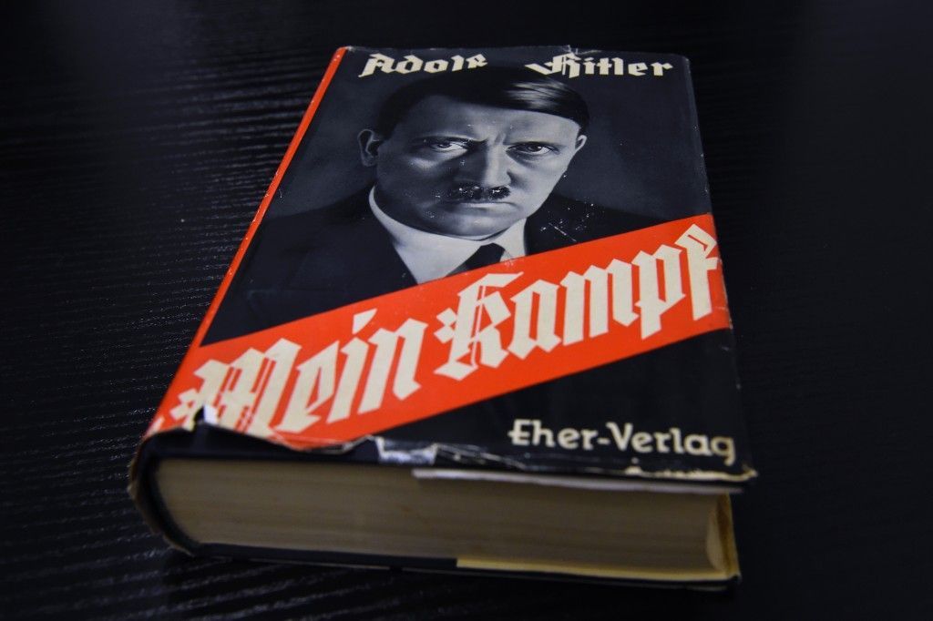
Pictured above: The cover of Hitler's book featuring Fraktur Blackletter type. (PBS News)
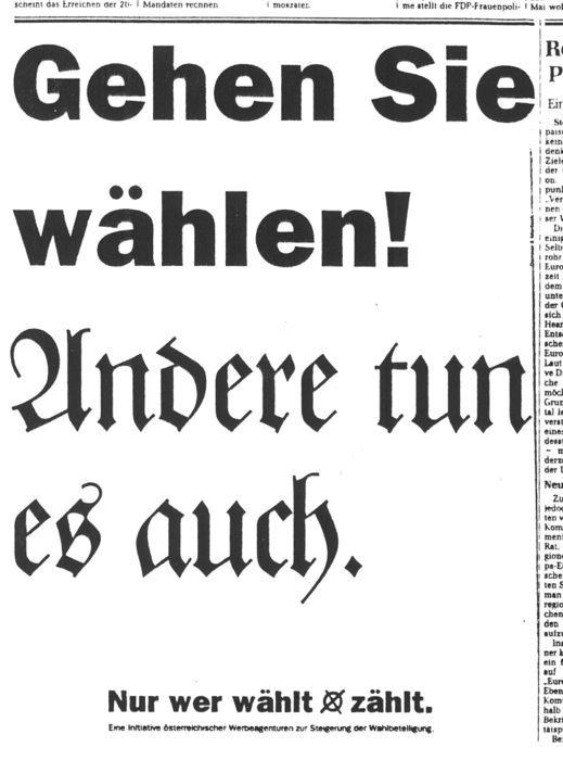
Poster in Germany translated as "Go vote! Others do as well." This poster clearly references Nazism simply by using blackletter and warns people of the consequences. (Unknown Designer)
Citations
1. Rath, Kyle. The Rhetoric of Type: An Exploration of the Experiential and Iconic Nature of Letterforms. 2015.
2. Rath, Kyle
3. Rath, Kyle
4. Bain, Peter, and Paul Shaw. Blackletter: Type and National Identity. New York: Princeton Architectural Press, 1998.
5. Bain, Peter,
6. Dobush, Grace. “German Design: Fraktur and the Psychology of Type.” Handelsblatt, © 2019 Handelsblatt GmbH - Ein Unternehmen Der Handelsblatt Media Group GmbH & Co. KG Verlags-Services Für Werbung: I| Verlags-Services Für Content: Lösungen Realisierung tinformationen: Vwd Vereinigte Der Kursdaten: Deutsche Börse, Nasdaq Und NYSE, Nutzungsbasierte Onlinewerbung, 28 Nov. 2018,